What is the Content Discovery Hub?
Spotify commands over 626 million monthly users and a third of the global streaming market — yet its content discovery experience is surprisingly disjointed. AI DJ, Daylist, Smart Shuffle, Discovery Weekly, and Daily Mixes all live in different corners of the app, with no central place to find or compare them.
For CSCI 499: Introduction to HCI at USC, my team investigated why Spotify’s discovery tools felt hard to find and use. We conducted heuristic evaluations, a 27-person survey, and four moderated user studies — ultimately designing and validating a Content Discovery Hub: a single, dedicated section that brings all discovery avenues together.
The research questions
And how can we improve the design to better personalize those experiences?
What UI patterns make AI features like Daylist and AI DJ more intuitive and trustworthy?
Discovery tools exist. Finding them doesn’t.
Spotify isn’t short on discovery features. The problem is that they’re scattered across a home page that changes constantly, buried behind unclear labels, and hard to revisit once you’ve stumbled across them. Users told us they felt like they were navigating a maze.
“I wish there was a more centralized ‘hub’ for discovering music where I could look at the various playlists Spotify recommends.”Survey respondent
Five heuristic violations
We each independently evaluated three key discovery flows against Nielsen’s 10 Usability Heuristics, then consolidated our findings into five recurring violations.
The home page surfaces too many unrelated sections simultaneously — violating Aesthetic and Minimal Design by overwhelming users before they can locate what they want.
The AI-generated playlist names use abstract or whimsical language that doesn't explain what the music actually sounds like. Violates Match Between System and Real World.
Controls for editing and sharing playlists are tucked behind non-obvious gestures. Users had to explore to find features they were actively looking for — a Flexibility and Efficiency violation.
Tapping the add button during playback silently adds the track to Liked Songs with no confirmation or alternative. Violates User Control and Freedom and Error Prevention.
Editing an AI-generated playlist replaces it outright rather than saving a version — making exploration feel risky. Another User Control and Freedom violation.
What 27 users told us
To validate and extend the heuristic findings, we ran a survey targeting active Spotify users. We asked about discovery habits, categorization preferences, and what they wished the app did better.
How often do people use Spotify to discover music?
The majority use Spotify specifically for discovery at least once a week — these are the core users our redesign needs to serve.
A smaller but engaged cohort uses discovery features every day, signaling appetite for a richer, always-present discovery experience.
How users discover and organize
Personalized playlists (like Discover Weekly) were the most-cited path to new music — followed by pre-made Spotify playlists and playlist recommendations from friends.
Users categorize music primarily by mood, then genre, then artist — suggesting that mood-based browsing should be a first-class experience in any redesign.
Multiple respondents asked for a mood-based search ("hard to find a playlist that encompasses a vibe") and a centralized hub for all discovery tools.
“Being able to search for playlists by mood. It’s hard to find a playlist that encompasses a mood or vibe if the playlist name doesn’t have exactly what you’re looking for.”Survey respondent
The core hypothesis
Spotify already has an ample number of discovery avenues — AI DJ, Daylist, Smart Shuffle, Daily Mixes. The friction isn’t the features themselves; it’s that they’re scattered across a home page that changes unpredictably. Our hypothesis:
Creating a dedicated space for content discovery will help users more easily identify and access relevant tools in their music journey.
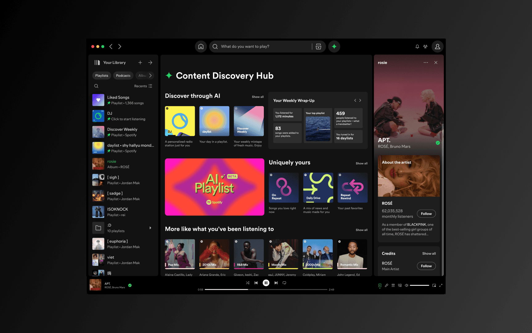
The Content Discovery Hub
Rather than redesigning all of Spotify, we proposed a focused intervention: a new tab in the navigation — Content Discovery Hub — that aggregates every discovery tool into a single, scannable page. The home page stays for listening; the Hub is where you explore.
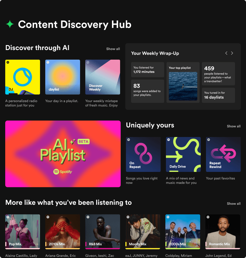
Four key sections
Surfaces AI DJ, Daylist, and Discovery Weekly in one row — the tools users wanted most, but struggled to find. Each is always available, not algorithmically hidden.
A Spotify Wrapped-style summary refreshed weekly: minutes listened, songs added, daylists generated, how many people played your playlists. Gives users a reason to return to the Hub regularly.
Personalized playlists (Radio, On Repeat, Your Top Mixes) presented as a persistent, labeled row — so users know these exist and can get back to them without searching.
An inline tooltip explains the Daylist's AI-generated name in plain terms. Addresses the heuristic violation around opaque descriptors and helps users build a mental model of the feature.
Four moderated user studies
We ran four moderated user studies with a within-subject design: each participant used both the original Spotify home page and the Content Discovery Hub prototype, completing identical tasks on each.
Tasks
After using each version, participants rated their satisfaction with the content sections on a 1–5 scale.
Timed task: find and name two tools you typically use for content discovery. We measured seconds to completion.
Daylist tooltip study
Separately, we showed participants their Daylist with and without the new tooltip and asked them to describe the playlist in their own words. We then coded the descriptions for specificity and use of music terminology.
"The daylist is very angsty about relationships, mostly the relationship phase where there's a lot of woes and issues." — vague, no musical vocabulary.
"Slow and melodic music, very mellow or warm songs with an autumny-vibe. That feeling of longing." — specific, uses the language the tooltip introduced.
Study limitations
Participants may have anticipated we were hoping for positive reactions and adjusted their behavior. We minimized this by withholding our research goals until after the session.
Because Spotify surfaces content algorithmically, different users see different home pages. We mitigated this by anchoring tasks on historically stable sections (Daily Mixes) rather than personalized recommendations.
What the numbers showed
Both quantitative measures moved significantly in the right direction — and the qualitative data on Daylist tooltips showed a meaningful shift in how users described and understood the feature.
Three key implications
A 45% drop in time-to-find directly supports our hypothesis: when discovery tools live in one place, users spend less effort navigating and more time actually listening.
Higher satisfaction scores suggest that framing AI features alongside other discovery tools — rather than scattering them — makes them feel more coherent and worth using.
Users described their Daylist with richer, more musical language after reading the tooltip. Contextual guidance doesn't just explain a feature — it changes how people relate to it.
What I took away
Simplicity is the hardest design decision
The instinct when redesigning a complex product is to add — new features, new sections, new affordances. What worked here was subtraction: rather than redesigning Spotify’s home page, we proposed a single dedicated tab and kept the rest of the app intact. A focused intervention outperformed a sweeping one.
Labeling is a design problem
The Daylist tooltip study made something concrete that I’d only understood abstractly: naming and framing directly shape how users understand and value a feature. "Daylist" means nothing. Explaining what the algorithm is doing — even briefly — lets users build a mental model and engage more deeply.
What I’d do differently
Our sample size was small (4 moderated sessions). A larger longitudinal study would reveal whether the 36% satisfaction gain holds over repeated use, or whether the novelty effect accounts for some of the improvement. I’d also want to run a proper thematic analysis on the daylist qualitative data to make the literacy finding more rigorous.
What’s next
The most interesting open question from this project is Spotify’s search experience. Multiple survey respondents mentioned that searching by mood is impossible unless the playlist name matches exactly. Implementing natural language processing for search — where you can type “something calm and rainy” and get real results — would be a meaningful next step beyond the Hub.